DIY Ideas for Scandinavian Styled Living Rooms
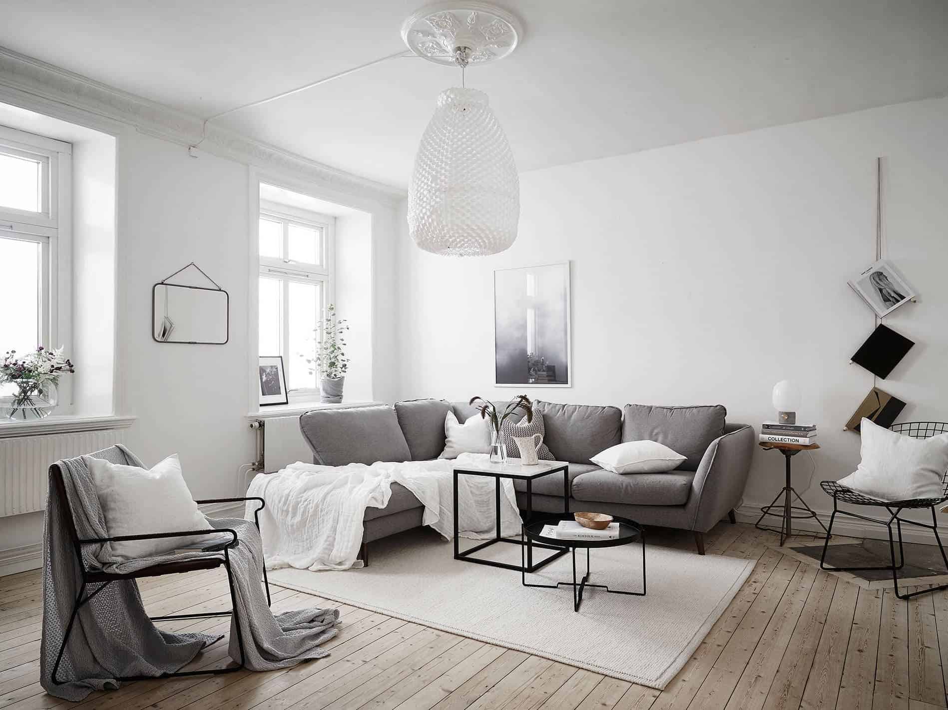
When it comes to trending interior decor styles, nothing has taken our fancy as of late quite like the Scandinavian aesthetic, especially as far as living rooms are concerned! We’ve been thinking about redoing the way our main room is decorated and establishing a new scheme and we’re certainly interested in including Scandinavian elements in 2019, so we’ve been on the lookout for different ideas, suggestions, advice, and elements that we might include quite easily, especially in ways that put our DIY and creative skills to good use.
Just in case you adore the idea of building a Scandinavian styled living room aesthetic just as much as we do, if not more, here are 15 f the best suggestions, tutorials, and resources we’ve come across so far in our search for inspiration!
1. Lots of contrasting patterns
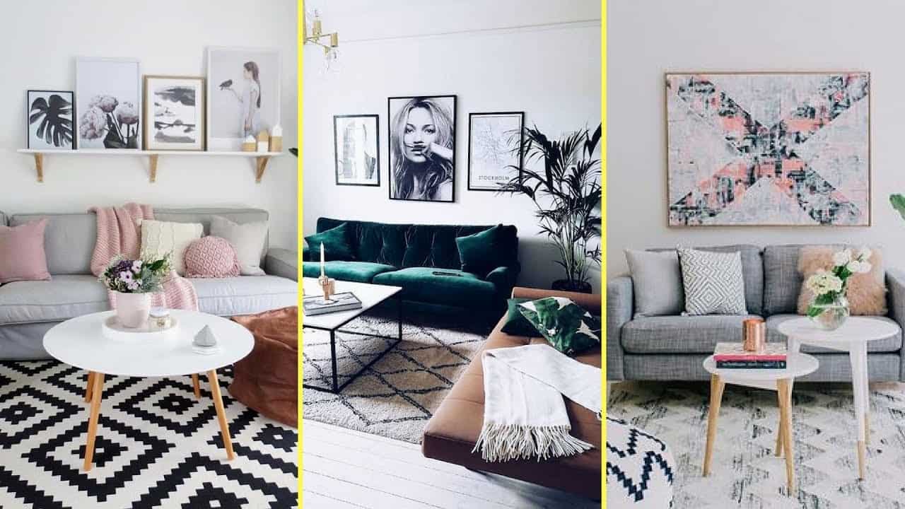
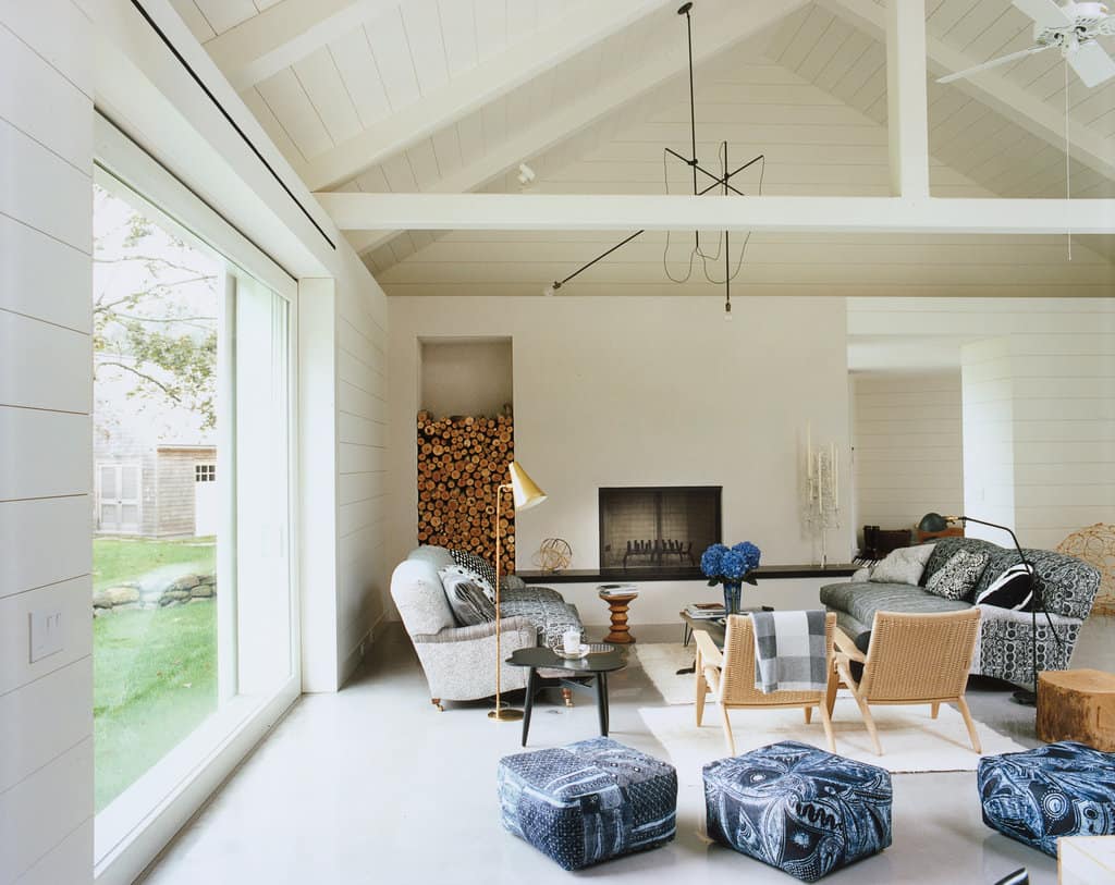
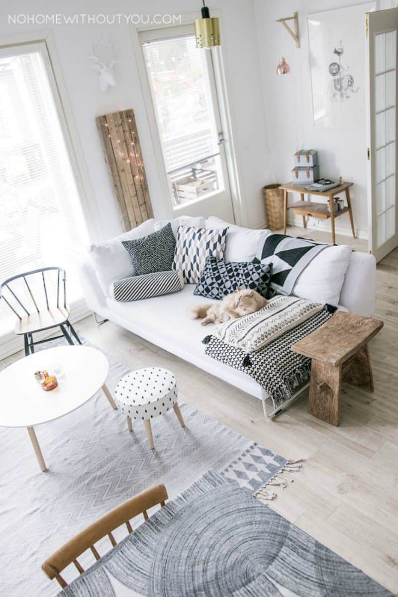
One of the very first things we noticed about explicitly styled Scandinavian living room schemes is the way designers always contrast patterns and visual textures in overt, eye catching ways. Homedit agrees and tells you all about it; choosing a Scandinavian aesthetic for your home is a fantastic opportunity to make and purchase things with all kinds of differing, exciting patterns in one place where they’ll play off each other.
2. Light wood (especially on the floors)
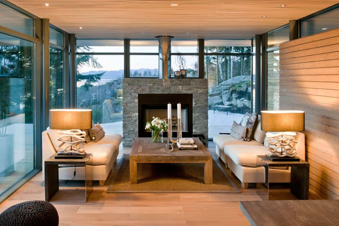
As you might expect, Scandinavian inspired homes are heavy in their use of natural wooden features. This is particularly true of the floors, which are nearly always wood finished. As you’ll see on Happy Grey Lucky, however, the most typical style of wood floor is a light one! This keeps the room feeling open and gives you more opportunity to work with other shades on the full colour spectrum within the room.
3. Light dining tables with darker contrasting chairs
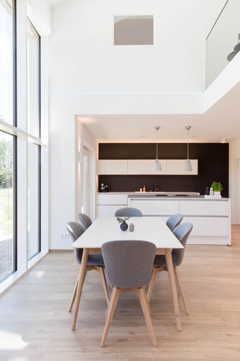
As you can probably already tell, contrast is huge in the world of Scandinavian decor. Patterns and visual textures aren’t the only thing that’s true for, though! Contrasting light and dark pieces to create balance in a room is also a central tenet of the style. Style Motivation gives you several examples of this, suggesting simple things like choosing a light coloured dining table but contrasting it with darker hued chairs all around.
4. Concentrated bright accents around neutrals
Believe it or not, there’s at least one other place where you’ll find balanced contrast in Scandinavian inspired decor! This is in the actual colours you choose to decorate with, rather than just pattern, finish, and materiality. Homedit suggests incorporating this element of the scheme into your living room by making light neutral shades the base of your furnishing style but adding a monochrome pop of colour in the form of bright accent pieces that suit each other cohesively.
5. Scandinavian style corner workspace
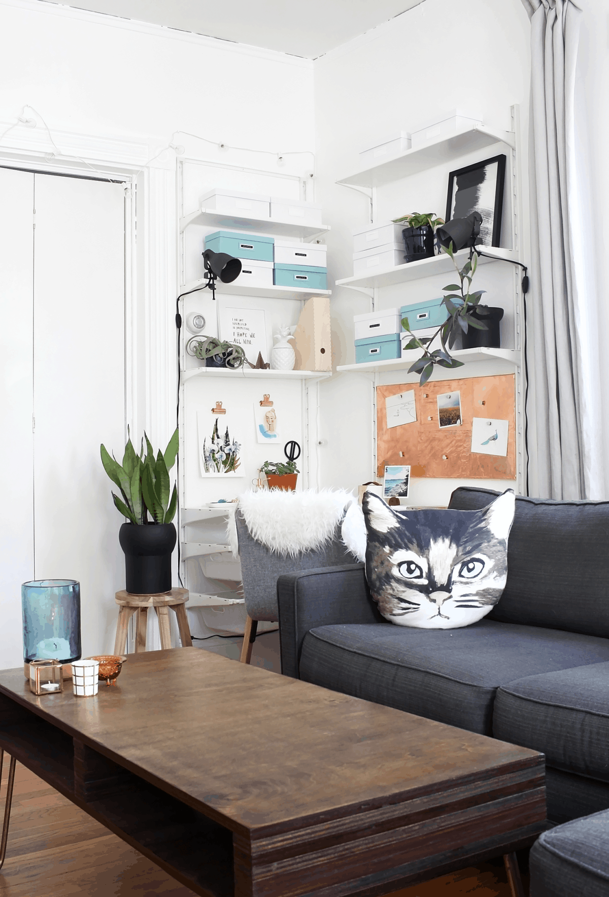
In addition to balance, Scandinavian decor is also a little bit about efficiency, minimalism, and use of space. That’s why we thought this little, space efficient corner office built into an unused corner of this Scandinavian living room was such a good idea! Idle Hands Awake walks you through the different elements included so that you might try making one of your own.
6. Planned but randomized stacked shelving
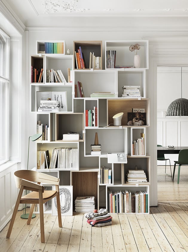
In addition to choosing things that already have interesting patterns and adding visual elements to your Scandinavian living room that way, you might include some of your own making, particularly if it’s also practical in use! We adore the way this resource from Trendir suggests painting upcycled wooden crates and stacking them at different heights and angles to make a neat looking and useful Scandinavian inspired storage shelf for things like books and trinkets.
7. Accents with physical texture
We’ve talked a lot about visual texture already, but Scandinavian styles are actually typically known to include pieces with a little bit of physical texture too! These awesome DIY knotted style pillows outlined step by step on Interior Pin are the perfect example of what we mean. Make them in bright colours that are reflected elsewhere in the room to help with your cohesive, concentrated colour pop like we mentioned earlier!
8. Differing uniquely shaped seating
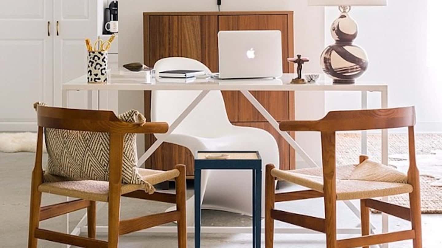
Sure, some parts of your Scandinavian room might thrive on cohesiveness, but we’re still looking for fun contrast and eye catching shape within this home aesthetic too, right? Personally, we’re huge fans of this suggestion featured on Ninety Four Design for incorporating that element in the form of differently shaped chairs for use in the same space. We like how their chairs here contrast each other not only in shape, but also in material and shade as well.
9. Minimalist and spacious layouts
If we had to pick one thing that was absolutely pivotal to a Scandinavian style while explaining it to someone who is new to the aesthetic, we’d probably list minimalist influenced space efficiency as the number one thing! We love the way this particular feature included in Women’s Weekly‘s discussion of Scandinavian living rooms exemplifies what we mean. The space has everything you need, but it’s clean looking, clutter free, and practical in its stylishness.
10. Walls with patterns and visual textures
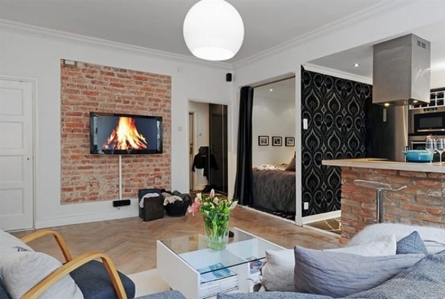
Perhaps you’re scrolling through our list and thinking a lot about textures and visual patterns but none of the ways of incorporating that have really grabbed your attention so far? In that case, we’d definitely suggest taking a look at the way DIY Home Life talks about adding texture and patterns to your walls rather than just your furniture or decor pieces. We’re completely in love with their example of a Scandinavian living room that contrasts exposed brick with a dark patterns accent wall.
11. lots of contrasting visual texture
Just in case you’re still feeling out this whole visual contrasts idea and you’re looking for even more examples to get you inspired and choosing or making pieces of your own, here’s an awesome discussion and feature from Flamingo Mango! They show you different ways in which patterns on the floor and the walls can be established using pieces that feature interesting shapes and lines but also eye catching things like photographs.
12. Dark, monochromatic schemes
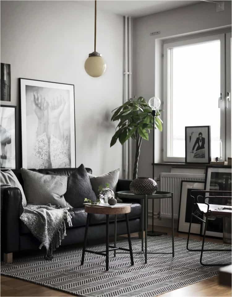
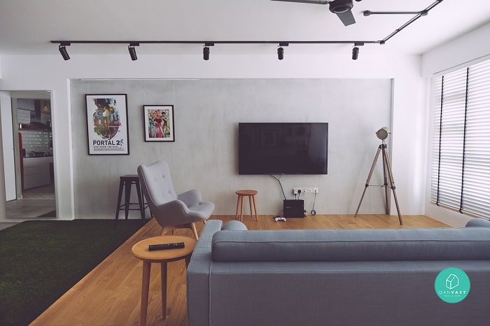
Not every Scandinavian inspired living room has to have a pop of colour in order to create its sense of contrast. Some people, like this feature on Your DIY Family, prefer to keep their minimalist inspired space a little more monochrome for comfort and consistency, playing with patterns and shapes instead! We love the way this room uses dark hues along the grey scale to create consistency, injecting some visual appeal in the form of a patterned floor mat and interestingly shaped furnishings.
13. Prints, prints, and more prints
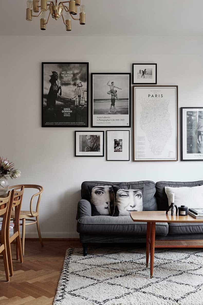
Did we actually really catch your attention when we started talking about the idea of creating visual contrast with photos? In that case, we think you’ll really enjoy this suggestion and feature from Digs Digs that relies heavily on awesome prints on the walls and in their decorative details to create their contrast in a stylish and almost historical looking way. You could choose colourful pieces if you’re looking to include that colour pop we talked about previously, or follow what you see here and choose prints and pieces that feature black and white or greyscale images instead.
14. Scandinavian inspired DIY hanging art
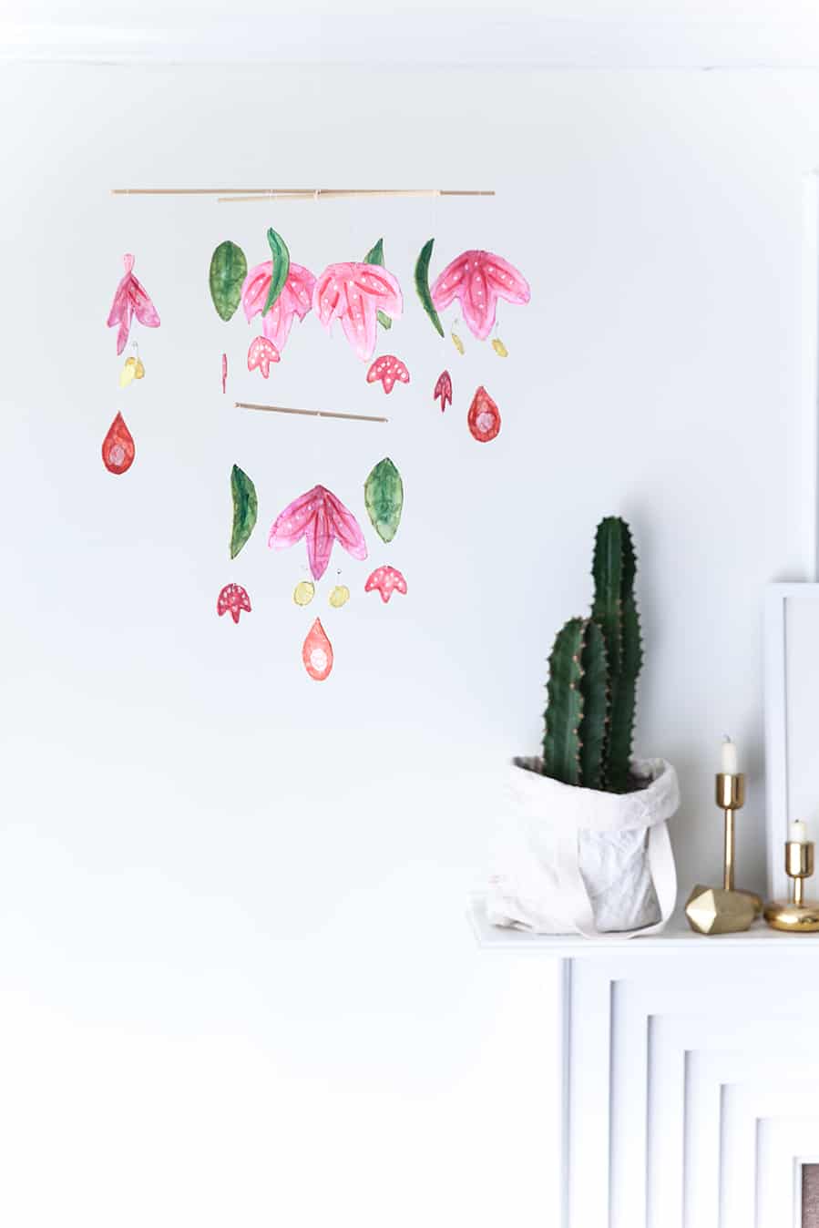
Perhaps you’ve actually already finished most of your Scandinavian decor scheme in your new living room but you’re looking for a couple crafty little details that you can include around the space for character? We see nothing wrong with adding a few pieces to show guests that you like to get hands-on with your decor! Take a look a the way The House That Lars Built made Scandinavian inspired wall hangers that are minimalist in shape but contrasting and full of cheer in their colour.
15. Cozy, warm neutrals
If, in the end, you decided that you’re definitely a bigger fan of the monochrome side of Scandinavian style, rather than the wildly patterned and colour pop balanced end of things, then we think you might get along with something a little closer to this feature on Homesthetics. Note the way they’ve chosen to create colour balance by choosing two primary shades that contrast, but kept both of them in the warm, neutral tones to keep a minimalist, natural look that’s truly comforting!
Do you . know someone who has been looking for inspiration and some DIY suggestions for redecorating their own living room in a Scandinavian inspired style but who could use a bit of guidance? Share this post with them so they have all kinds of ideas and details to choose from!
